California Hall Wayfinding
& Signage System
Environmental Graphic Design & Placemaking
Role: Co-Designer (with Nicole Arteaga)
Tools: Illustrator, InDesign, Photoshop
Course Project: DES 186 – Environmental Graphics
Completed: March 2019
Project Overview
This project involved designing a comprehensive wayfinding and signage system for California Hall, a newly constructed lecture building at UC Davis. Completed in collaboration with Nicole Arteaga for our Environmental Graphics course, the goal was to create a cohesive visual and spatial experience that not only aids navigation but also reflects the cultural and geographic diversity of the university and California itself.
Our design approach combined placemaking strategy, identity development, and universal design principles to create a system that enhances user orientation, supports intuitive movement, and celebrates individuality within a shared campus environment.
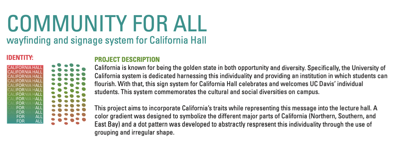
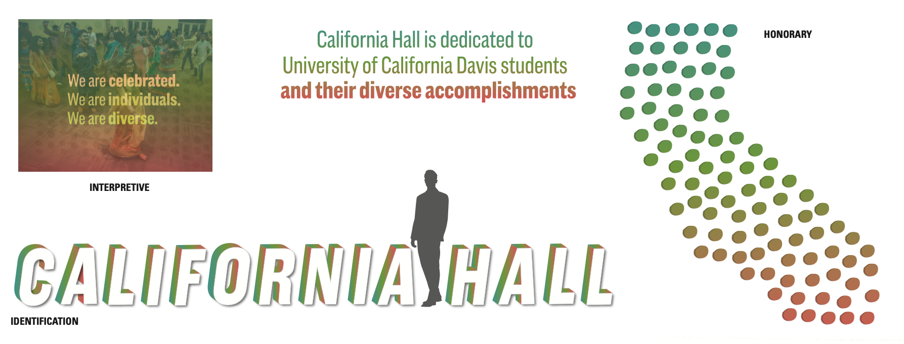
Design Concept: California as a Cultural Identity
Rooted in the idea of “Community For All,” the visual identity draws inspiration from California’s unique diversity—both socially and geographically.
A custom color gradient (blue → green → red) symbolizes California’s major regions: Northern, Southern, and East Bay.
A flexible dot pattern system, abstracted from visual clustering and motion, represents individuality within collectivity—offering a subtle metaphor for UC Davis students’ unique paths within a shared academic experience.
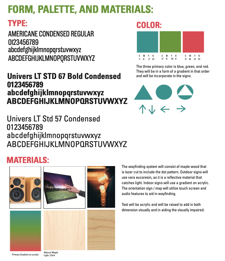
Typography and form were selected to balance clarity and warmth: American Condensed for titles, and Univers LT Std Condensed for directional information, ensuring legibility at varying distances and scales.
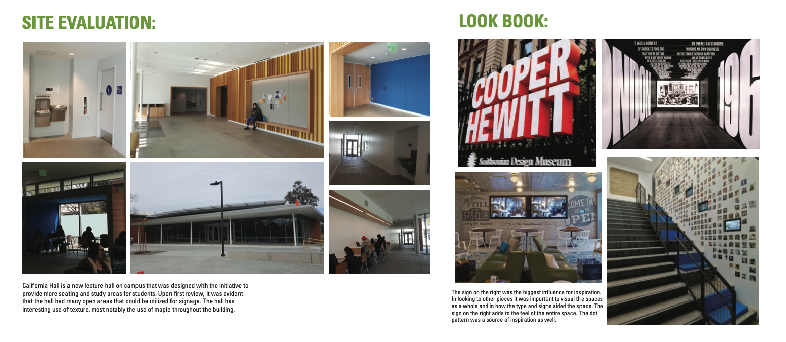
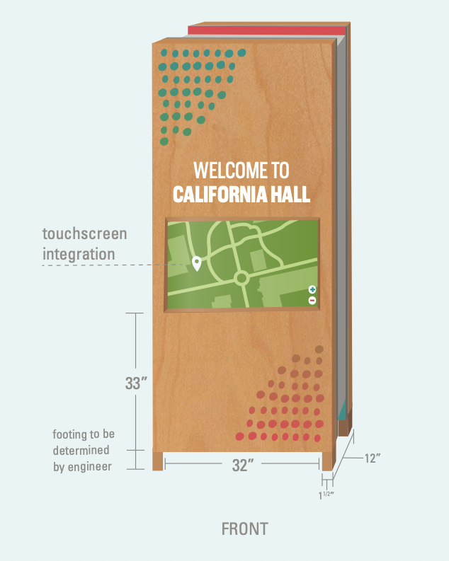
Site Context & Materiality
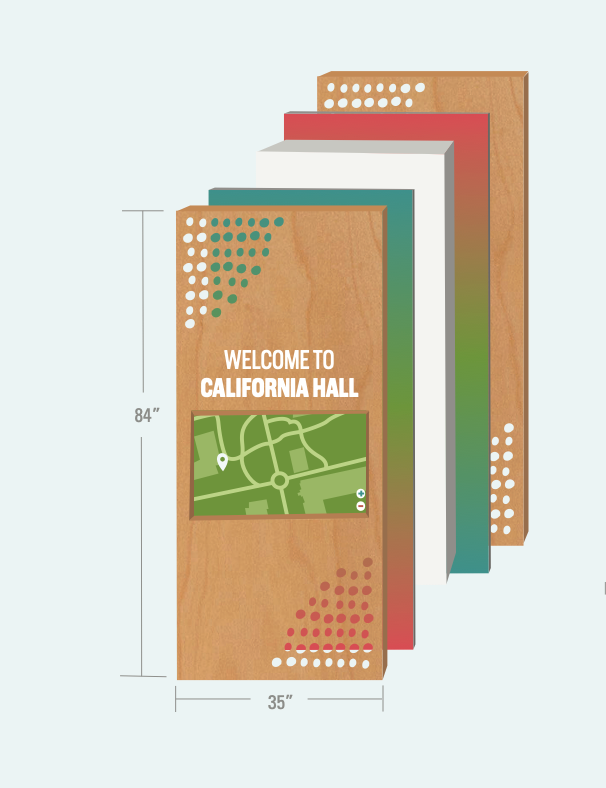
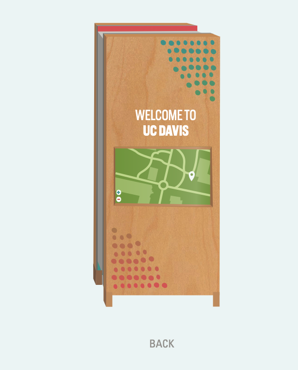
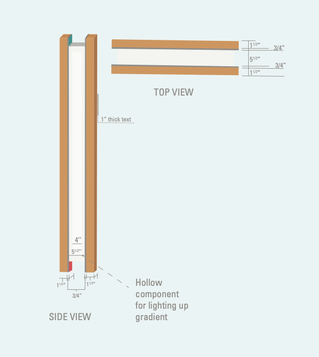
During our site evaluation, we studied circulation flow, natural gathering points, and material textures used throughout the architecture. Maple wood was a key design material used in the building interiors, and it informed our material palette to maintain architectural coherence.
Interior signage incorporates laser-cut maple wood with the custom dot pattern to create depth and texture.
Gradient panels printed on acrylic provide contrast and visual rhythm along corridors.
Exterior signage uses Vara eucoresin, a reflective material that enhances visibility in daylight and low light conditions.
Tactile letterforms and raised acrylic text improve accessibility and meet ADA compliance.
A large orientation map integrates touchscreen and audio features, designed for multi-sensory wayfinding.
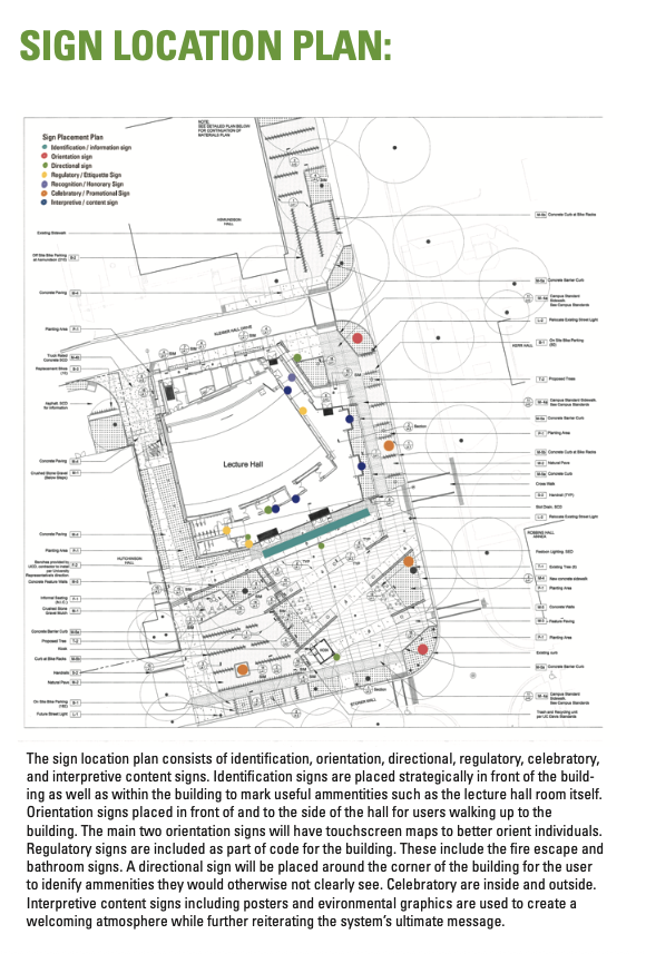
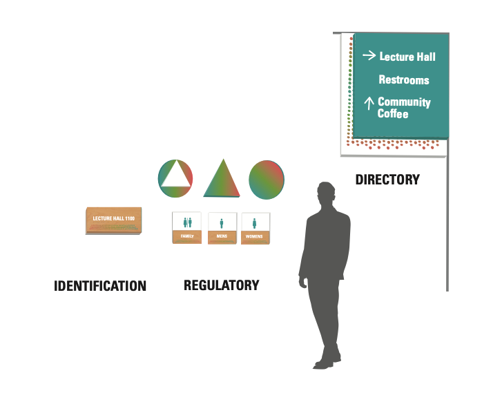
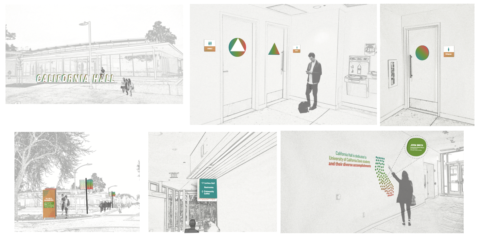
Wayfinding Strategy & Sign Hierarchy
We structured the signage system around six core types, each mapped by function and spatial proximity:
Identification signage marks building entries and amenities like lecture rooms
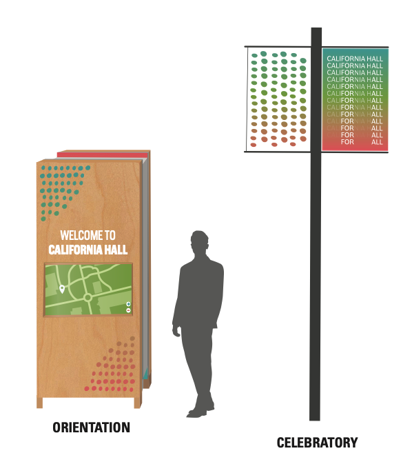
Orientation signage (digital and static) anchors key approach zones with spatial overviews
Directional signage assists lateral movement around corners and less-visible spaces
Regulatory signage meets code requirements for fire exits, restrooms, and accessibility
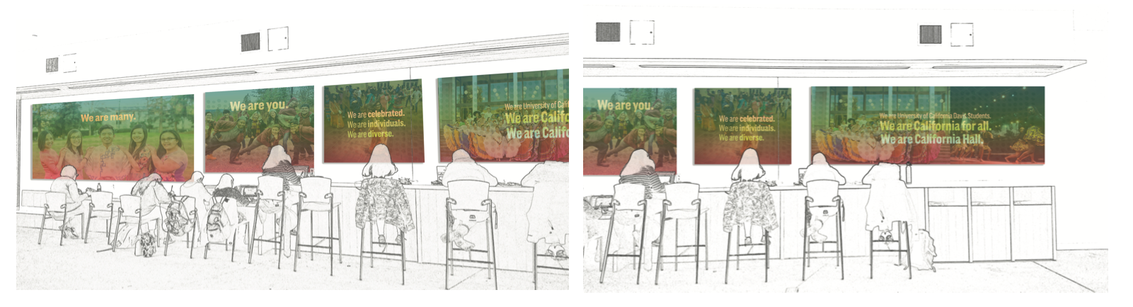
Interpretive signage includes environmental graphics and campus storytelling
Celebratory signage reinforces campus culture and invites connection
This layered approach creates a clear visual hierarchy while supporting micro-decisions in user movement—reducing cognitive load and increasing spatial confidence.
Signage is not just functional—it’s spatial storytelling. We used every sign as an opportunity to build identity, aid orientation, and foster belonging.
Deliverables
Site analysis and circulation mapping
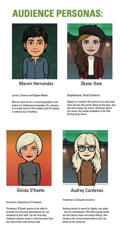
Audience persona development
Visual identity system and pattern language
Signage form palette and materials research
Sign placement plan and typology
In-situ renderings and contextual mockups
Detailed spec of a digital orientation sign with dimensions and materials
Final presentation book and signage lookbook
Reflection
Designing for physical space challenged us to think across disciplines—architecture, accessibility, and communication design. This project sharpened my understanding of sign hierarchy, spatial logic, and the emotional role signage can play in shaping a visitor’s first impression. It confirmed my passion for wayfinding, exhibition systems, and placemaking—areas where design functions as both guide and storyteller.